Sliders, the eternal enemy: why your website is slow
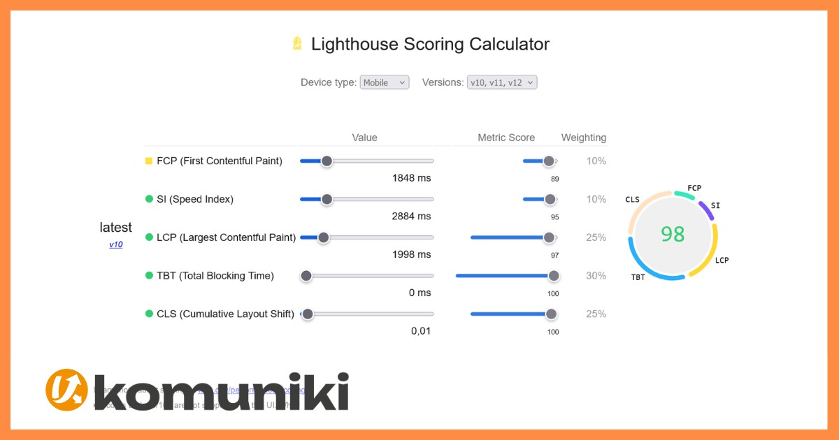
When we analyze a website with Lighthouse, Google measures 5 different timings, each with a different weight in the final score. Below we explain what each metric means and, afterward, why sliders tend to be a problem both for speed and usability.
What Google actually measures with Lighthouse
FCP (First Contentful Paint) · Weight 10%
This is the moment the user first sees something on screen. If it takes too long, the user thinks the site isn’t loading and leaves.
SI (Speed Index) · Weight 10%
Measures how quickly all the content is visually “painted.” It’s the overall speed at which the page appears.
LCP (Largest Contentful Paint) · Weight 25%
The largest element on screen (usually an image or the main text block). It’s the metric most associated with “the page has finished loading.”
TBT (Total Blocking Time) · Weight 30%
The most important one. The time the browser spends busy executing code that isn’t responding to user clicks or taps. This is where heavy JavaScript shows the most.
CLS (Cumulative Layout Shift) · Weight 25%
Measures whether elements “jump” while the page loads. Has it ever happened that you go to click and the button moves, making you miss it or click somewhere else? That’s CLS.
Clients love sliders, developers not so much
There’s a solid technical reason: sliders usually add extra JavaScript right at the top of the site, exactly where it most affects FCP and LCP (on top of images or videos), slowing down precisely the moment users notice the most.
But the problem isn’t just about speed, it’s also about user behavior.
How users actually behave when landing on a website
In practice, no visitor waits passively for 3, 5, or 7 seconds for the slider to change image or video. What they do, in the first 1-3 seconds, is read the headline at the top and then, just like on social media (out of habit), scroll down.
That means one clear thing: the second piece of information on the page is just as important as the first. It makes no sense to concentrate all conversion efforts only at the top (hero + slider) if the user is already scrolling down.
The solution: a fixed image and a CTA in every block
Instead of locking attention at the top with a slider, it’s better to use a fixed image: engagement and emotional impact are conveyed just as well, without penalizing loading speed. And keep pace with the scroll.
Each block on the page should have its own useful CTA, designed to convert at that exact point in the journey.
“`